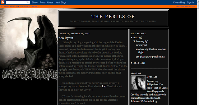
new layout
I thought my blog was getting a bit boring, so I decided to shake things up a bit by changing the layout. What do you think? I personally enjoy the darkness and the simplicity of my new theme. Check out the classy white border around the header, reminiscent of the Renaissance period. The picture of the Grim Reaper sitting atop a pile of skulls is also a nice touch, don't you think? It is a reminder to cherish every second of life we have left before we end up empty skulls underneath Death's tushie. Plus, the squiggly text that says MYSPACEBRAND underneath the picture just encapsulates the mangy grunge feel I knew this blog had always lacked.
I'm kidding, of course. If you haven't guessed already, I changed my layout because I lost a bet to Rap. Thanks for not showing up to class, Mr. Javier. :|
(I'd post this drawing I made just now of me with an ice cream cone to brighten things up in here a bit, but my SmartBro connection won't let me.)
. . .
In other news, I've been getting some comments from incoming college freshmen on my old posts about entrance exams! Yay. :D I hope this layout doesn't scare off new visitors. :))
. . .
For how much longer is this going to be on my blog, Rap? :|


appeasement anon here. y is it back to the old layout?
ReplyDeletehello, appeasement! :D the three days are up. :))
ReplyDeleteahhh time limit... so wen next post going up? appeasement not as appeased as it use 2
ReplyDeleteOh, hey. :(
ReplyDeleteSorry for the delay. I've got two new ones up. :))
yay appeassed
ReplyDelete